Xbox 360

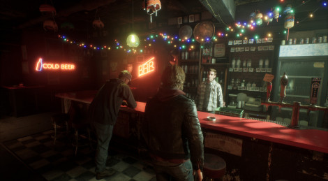
The PR agencies are starting the hype-machines again, after being offline the last week. Sega today released these images of Chromehounds, which seems to look better every time we see it.

19 images

  • Images of Chromehounds - 19 images
  • Images of Chromehounds - 19 images
  • Images of Chromehounds - 19 images
  • Images of Chromehounds - 19 images
  • Images of Chromehounds - 19 images
  • Images of Chromehounds - 19 images
  • Images of Chromehounds - 19 images
  • Images of Chromehounds - 19 images
  • Images of Chromehounds - 19 images
  • Images of Chromehounds - 19 images
  • Images of Chromehounds - 19 images
  • Images of Chromehounds - 19 images
  • Images of Chromehounds - 19 images
  • Images of Chromehounds - 19 images
  • Images of Chromehounds - 19 images
  • Images of Chromehounds - 19 images
  • Images of Chromehounds - 19 images
  • Images of Chromehounds - 19 images
  • Images of Chromehounds - 19 images
slip36
slip36
Commented on 2006-05-22 21:23:12
desert scenes look awsome
In reply to
roxwell - PuS3Y
roxwell
Commented on 2006-05-22 21:29:32
Mechs are looking great now.
scenery is still looking bland to me.
In reply to
Optimusv2
Optimusv2
Commented on 2006-05-22 21:31:44
I saw this baby on my 50 inch hdtv during g4's e3 coverage. The lighting from what I saw was great and the shadows were VERY nicely done.

This game graphically looks surprisingly alot better than many here would have suspected.
In reply to
indigo0086
indigo0086
Commented on 2006-05-22 21:33:58
in this pic
http://images.xboxyde.com/gallery/public/3435/822_...

what is that graph called? I see it on a several japanese stat type things in games and cards.
In reply to
LEBATO - IS WRONG
LEBATO
Commented on 2006-05-22 21:43:36
The game looks ugly. The mechs look really nice as well as the lighting and some of the effects such as explosions. The environments look downright awful bringing the quality of the graphics down by a lot. Someone said the desert looks great, yes it does, it looks empty as a desert, but what about everything else?

http://images.xboxyde.com/gallery/public/3435/822_...

That looks really bad, it looks disgusting. Knowing this came from the Otogi creators, seeing such uninspired environments is unnaceptable IMO.
In reply to
Optimusv2
Optimusv2
Commented on 2006-05-22 21:44:15
I see it in anime alot its basically telling the strengths and weaknesses of the mech.

It is used in Naruto as well by a character called kabuto. He makes these cards from chakra (life energy) to keep track of the abilities of many of the ninjas he encounters.

Whatever CMD is in this game that specific mech is amazing at it. Maybe it has more command options than anything else? I mean the thing has about 3 satellites on it.
In reply to
Manager - Shemale
Manager
Commented on 2006-05-22 21:57:25 In reply to LEBATO
Posted by LEBATO
The game looks ugly. The mechs look really nice as well as the lighting and some of the effects such as explosions. The environments look downright awful bringing the quality of the graphics down by a lot. Someone said the desert looks great, yes it does, it looks empty as a desert, but what about everything else?

http://images.xboxyde.com/gallery/public/3435/822_...

That looks really bad, it looks disgusting. Knowing this came from the Otogi creators, seeing such uninspired environments is unnaceptable IMO.
I myself like the whole realism-feeling. I hate when developers puts 34834 polygons on a single tree, without even having some lighting that can do some nice shadows!
This seems to be Operation Flashpoint for mechs. As long as the mechs looks great and it have all those "special effects", like nice lighting, explosions and shadows, I'm not concerned about this at all. On the other hand, I myself won't buy it. But I think the graphics looks more than acceptable. I prefer alot of objects and realism, than a mix of advanced and simple stuff. Kind of like the Fifa & PES difference. Animations and realistic faces over overall high-poly textures.
In reply to
godhandiscen
godhandiscen
Commented on 2006-05-22 22:02:35
The mech with the ultra satellite system is a joke, it looks horrible. However since the mechs are divided in classes, this mech is more likely the "intel" mech in the team.
In reply to
Optimusv2
Optimusv2
Commented on 2006-05-22 22:09:13
The environment looked awesome to me blown up on my hdtv when they were showing it during actual gameplay on g4.

I know its not the most amazing thing, but it definetly works.
In reply to
xiler8er360
xiler8er360
Commented on 2006-05-22 22:13:47
looking better each time. deffo on my 'to watch list'
In reply to
QuezcatoL
QuezcatoL
Commented on 2006-05-22 22:21:42
Something they surely can do awesome is robots!,mechs :)
In reply to
lukasblue
lukasblue
Commented on 2006-05-22 22:27:01
Mechs are good but environment is lacking. It should be more photo-real. It looks odd, one tree standing in the middle of nowhere. More procedural synthesis please.
In reply to
bloodforge
bloodforge
Commented on 2006-05-22 23:00:53
Looking really good, I really like how you can see right into the cockpit of the four legged one. I don't see the problem with the environments, normal rural outdoor areas really aren't that spectacular to look at to begin with(at least not to me, having fields all around my house with trees spotted everywhere, I never look out the window and think, WOW look at those wheat fields, awsome). But the fact that you are in a giant mech makes any detail that you could add be unnoticable unless you were human size walking on the ground.
In reply to
modifiedbears
modifiedbears
Commented on 2006-05-22 23:01:36
it'd be so much cooler if these things were cutting paths through dense forests. like everyone is saying the environments are just horrible. i hope the explosions look nice.
In reply to
Denjinflash
Denjinflash
Commented on 2006-05-22 23:18:42
haha, after spending so much time with the lost planet demo, i now really, really like the mech designs in that game. comparing those to these, chromehound's seem like some sort super-tanks instead. still very cool.
looking forward to front mission 6 on ps3 or 360(hopefully)
In reply to
Mech_Master
Mech_Master
Commented on 2006-05-22 23:35:45
Mechs look great, environments look current gen quality. Should still be fun though.
In reply to
Optimusv2
Optimusv2
Commented on 2006-05-23 00:07:38
The environments are most certainly not current gen quality. This game seriously needs to be seen on a large screen to understand just how good it looks.

I've seen it during actual gameplay on g4tv and it looks incredible. The environments aren't super quality, but when you see the mech combined with the lighting and shadows on a huge hdtv or something many will forget about the environments.
In reply to
XSAVAGE
XSAVAGE
Commented on 2006-05-23 00:09:32
Where are the cities? , looks very empty.
In reply to
yourgoodtwin
yourgoodtwin
Commented on 2006-05-23 00:35:12
I have to agree about the shoddy environments. The mechs themselves are beautiful and if the game is amazingly fun, it won't really matter, but these graphics are really bottom of the barrel. The trees are cut-outs with that blurry edge look that reminds me of PS1 games or workhorse graphics on a PS2 game. Just bad, and I think a massive environment game like this NEEDS those graphics to be at least passable for next-gen.
In reply to
HDTran
HDTran
Commented on 2006-05-23 04:41:19
The grid signifies the class bias of the current setup of the mech. Sniper, Heavy Gunner, Defender, Commander, Soldier, and Scout.
In reply to
memolo
memolo
Commented on 2006-05-23 08:15:05
It looks bad, I want to think that this lack of environments is done gameplay wise to enhance the fights but it sure doesn't look good.
In reply to
superjesse
superjesse
Commented on 2006-05-23 10:34:59 In reply to LEBATO
Posted by LEBATO
The game looks ugly. The mechs look really nice as well as the lighting and some of the effects such as explosions. The environments look downright awful bringing the quality of the graphics down by a lot. Someone said the desert looks great, yes it does, it looks empty as a desert, but what about everything else?

http://images.xboxyde.com/gallery/public/3435/822_...

That looks really bad, it looks disgusting. Knowing this came from the Otogi creators, seeing such uninspired environments is unnaceptable IMO.
Exactly what I think.
In reply to
About the game
Platform
X360
Published by
SEGA
Developed by
FromSoftware Inc.
Patreon

$135 of $400 per month

What's up?
  • Loakum

    Loakum @Driftwood Awesome! I’m loving it! It does show a much crisper picture and the frame rate looks good! I was playing Stella Blade and Dragonball Soarkling Blast! :) (2 Weeks ago)

  • Driftwood

    Driftwood @Loakum: enjoy, the one Sony sent us will be there on launch day. Coverage will follow asap. (2 Weeks ago)

  • Loakum

    Loakum *takes a large sip of victorious grape juice* ok….my PS5 pro arrived early! So much winning! :) (2 Weeks ago)

  • Driftwood

    Driftwood @reneyvane: non ils l'ont publié le 1er octobre et je crois que tu l'avais déjà linkée. ;) (5 Weeks ago)

  • reneyvane

    reneyvane Factornews à joué à KingdomComeDeliverance2 au Gamescom 2024 mais ne publie sa preview que maintenant ? [url] (7 Weeks ago)

  • CraCra

    CraCra Y a un souci sur les forums ? (8 Weeks ago)

  • nostradamus

    nostradamus very few with religious beliefs are naive or zealots, but for sure don't find amusing their beliefs being thrown in for clout. maybe STFU with that discourse? (11 Weeks ago)

  • Driftwood

    Driftwood Download is now functional again on Gamersyde. Sorry for the past 53 days or so when it wasn't. (> 3 Months ago)

  • Driftwood

    Driftwood Another (French) livestream today at 2:30 CEST but you're welcome to drop by and speak English. I will gladly answer in English when I get a chance to catch a breath. :) (> 3 Months ago)

  • Driftwood

    Driftwood GSY is getting some nice content at 3 pm CEST with our July podcast and some videos of the Deus Ex Mankind Divided preview build. :) (> 3 Months ago)

  • Driftwood

    Driftwood For once we'll be live at 4:30 pm CEST. Blim should not even be tired! (> 3 Months ago)

  • Driftwood

    Driftwood More Quantum Break coverage coming in a few hours, 9:00 a.m CEST. (> 3 Months ago)

  • Driftwood

    Driftwood We'll have a full review up for Firewatch at 7 pm CET. Videos will only be tomorrow though. (> 3 Months ago)

  • Driftwood

    Driftwood Tonight's livestream will be at 9:15 GMT+1, not GMT+2 as first stated. (> 3 Months ago)

Also on Gamersyde

The First 43 Minutes of Loco Motive

  • Thursday, November 21, 2024
  • Driftwood

Our Switch video of Ys X: Nordics

  • Wednesday, November 20, 2024
  • davton

The Callisto Protocol is now PS5 Pro Enhanced

  • Wednesday, November 20, 2024
  • Driftwood